Melon 🍈
Design System
Melon 🍈
Design System
Melon 🍈
Design System
A consistent and scalable design system for eCommerce and content rich web designs.
A consistent and scalable design system for eCommerce and content rich web designs.
11
Reusable
Components
3
Responsive
Websites
3
Naming Token
Layers
Duration
Duration
Feb - March 2025
Tools
Figma
Airtable
Jira
Googlemeet
Design System Overview
The Melon Space Store Design System project focuses on creating a cohesive and scalable framework for the store’s three core offerings: e-commerce store, learning hub, and fashion store. By establishing a unified visual language, reusable component library, and centralized design tokens, the system ensures a seamless and consistent user experience across all platforms.
The Melon Space Store Design System project focuses on creating a cohesive and scalable framework for the store’s three core offerings: e-commerce store, learning hub, and fashion store. By establishing a unified visual language, reusable component library, and centralized design tokens, the system ensures a seamless and consistent user experience across all platforms.
Visual Language
Visual Language
Consistent visual elements that create harmony across all platforms
Consistent visual elements that create harmony across all platforms
Component Library
Component Library
Reusable components built with flexibility and accessibility in mind
Reusable components built with flexibility and accessibility in mind
Design Tokens
Design Tokens
Standardized design decisions encoded as variables
Standardized design decisions encoded as variables
Our Team

Su Nandar
Su Nandar
Lead Designer
Lead Designer

Ingyinn Swe
Ingyinn Swe
Lead Designer
Lead Designer

Swann Yi Maung
Swann Yi Maung
Lead Designer
Lead Designer

Htike Saen
Htike Saen
Lead Designer
Lead Designer
Goals
We want to establish a consistent and scalable design system because it ensures a seamless user experience across all products.
We want to establish a consistent and scalable design system because it ensures a seamless user experience across all products.
Problem Statment
A potential obstacle is maintaining consistency across multiple platforms, but we believe we can overcome it by establishing clear design guidelines and reusable components.
A potential obstacle is maintaining consistency across multiple platforms, but we believe we can overcome it by establishing clear design guidelines and reusable components.
Process
Research & Discovery
Understand the problem, users, and requirements.
Understand the problem, users, and requirements.
Define Foundations
Establish the core elements of the design system.
Establish the core elements of the design system.
Build Component Library
Create reusable UI components for efficiency and consistency.
Create reusable UI components for efficiency and consistency.
Design the Product
Apply the design system to create a user-centered product.
Apply the design system to create a user-centered product.
Research & Discovery
Information Architecture
Information Architecture
To establish a clear understanding of our design system, we began by conducting an information architecture analysis, creating wireframes based on IA and a comprehensive audit. This process helped us identify the essential & common components like navigation bar, banner , cards, button and footer to prioritize and develop, ensuring a structured and efficient design approach.
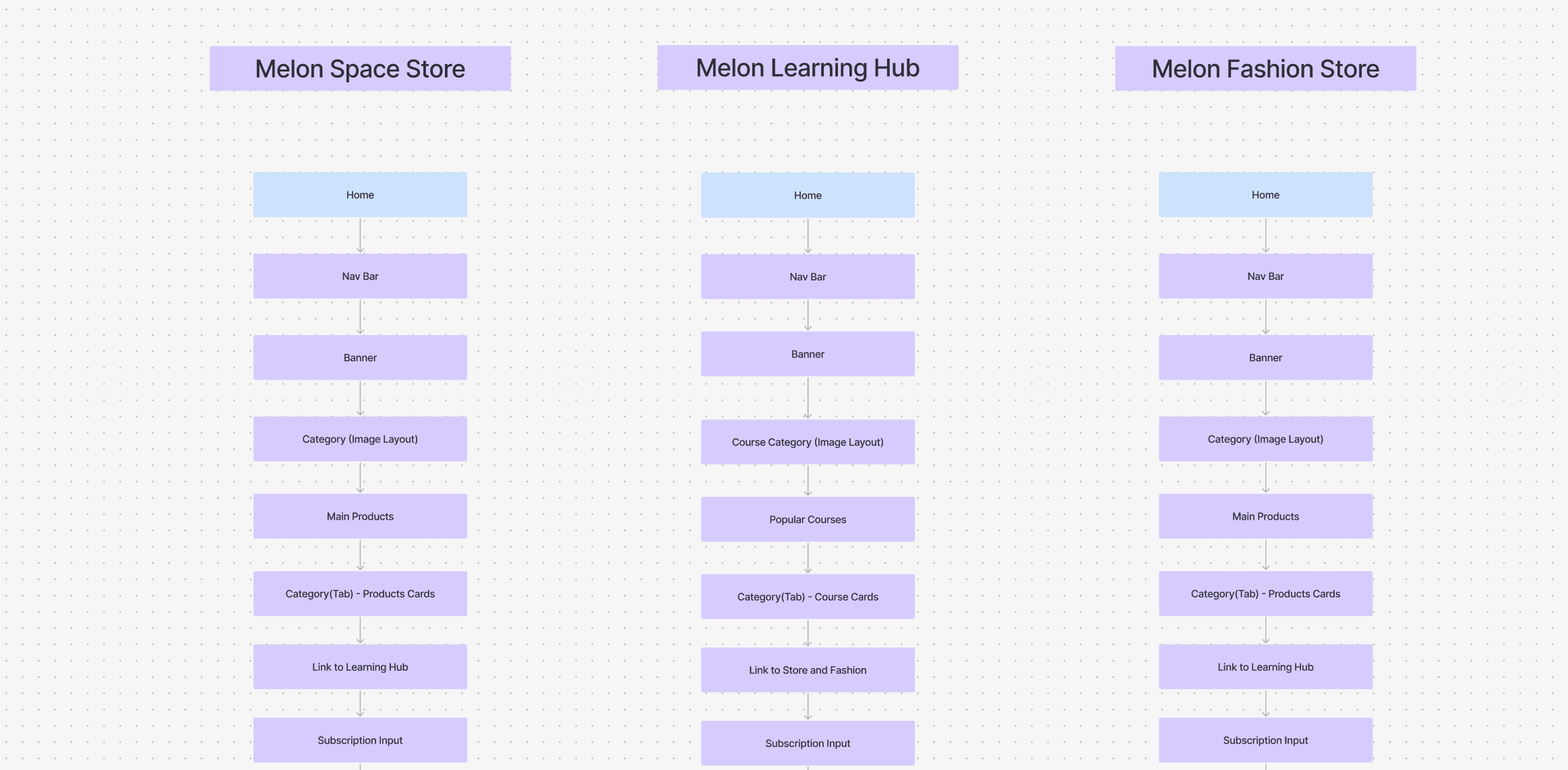
This diagram represents the information architecture of three different platforms within the "Melon" ecosystem:
To establish a clear understanding of our design system, we began by conducting an information architecture analysis, creating wireframes based on IA and a comprehensive audit. This process helped us identify the essential & common components like navigation bar, banner , cards, button and footer to prioritize and develop, ensuring a structured and efficient design approach.
This diagram represents the information architecture of three different platforms within the "Melon" ecosystem:
Melon Space Store
Melon Learning Hub
Melon Fashion Store
Each follows a structured hierarchy to guide users efficiently through content, ensuring easy navigation and accessibility.
Each follows a structured hierarchy to guide users efficiently through content, ensuring easy navigation and accessibility.
Design System Roadmap
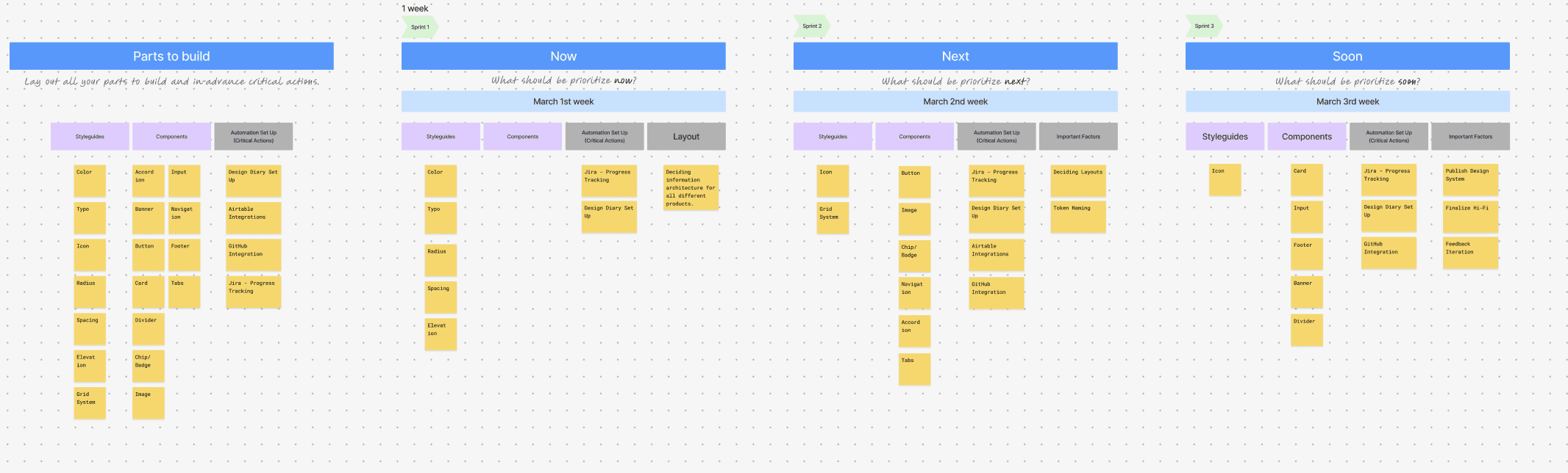
Our design system roadmap focus on basics like visual style, key UI components, and elements for displays.
Our design system roadmap focus on basics like visual style, key UI components, and elements for displays.
Potential Obstacles & Solutions
Potential Obstacles & Solutions
Lack of Understanding of Token Naming Conventions
Obstacle: Team members may not fully grasp the logic behind token naming, leading to misuse or inconsistency.
Solution: Provide clear documentation, real-world examples, and hands-on training sessions.
Obstacle: Team members may not fully grasp the logic behind token naming, leading to misuse or inconsistency.
Solution: Provide clear documentation, real-world examples, and hands-on training sessions.
Resistance to Adoption
Obstacle: Designers and developers may be accustomed to their existing workflow and resist switching to a new system.
Solution: Show tangible benefits, conduct workshops, and gradually integrate the system into projects.
Obstacle: Designers and developers may be accustomed to their existing workflow and resist switching to a new system.
Solution: Show tangible benefits, conduct workshops, and gradually integrate the system into projects.
Critical Actions
Critical Actions
Prioritize components like call to action, card, image since they contains multiple nested elements and interactions
Establishing a naming convention for maintaining consistency.
Prioritize components like call to action, card, image since they contains multiple nested elements and interactions
Establishing a naming convention for maintaining consistency.
When this goal is achieved:
When this goal is achieved:
Facts:
Brand consistency improvement is expected to increase by 40-60%.
Expected deliverables include design tokens for development and scalable components.
Feelings:
Designers, developers, and stakeholders will feel satisfied and happy, as the system streamlines workflow and ensures consistency.
Future:
Teams will be able to build and scale products faster with fewer inconsistencies.
Developers will be able to integrate UI components seamlessly with standardized tokens.
Designers will be able to focus on innovation rather than repetitive UI fixes.
Stakeholders will be able to see a more cohesive brand experience across all platforms.
Facts:
Brand consistency improvement is expected to increase by 40-60%.
Expected deliverables include design tokens for development and scalable components.
Feelings:
Designers, developers, and stakeholders will feel satisfied and happy, as the system streamlines workflow and ensures consistency.
Future:
Teams will be able to build and scale products faster with fewer inconsistencies.
Developers will be able to integrate UI components seamlessly with standardized tokens.
Designers will be able to focus on innovation rather than repetitive UI fixes.
Stakeholders will be able to see a more cohesive brand experience across all platforms.
Process Tracking with Jira
Process Tracking with Jira
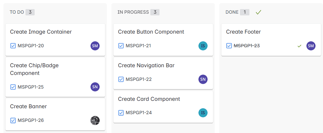
We used Jira to manage and track Melon design system by organizing tasks, tracking progress, and ensuring smooth collaboration among teams.
We used Jira to manage and track Melon design system by organizing tasks, tracking progress, and ensuring smooth collaboration among teams.
Define Foundations
Color
Color
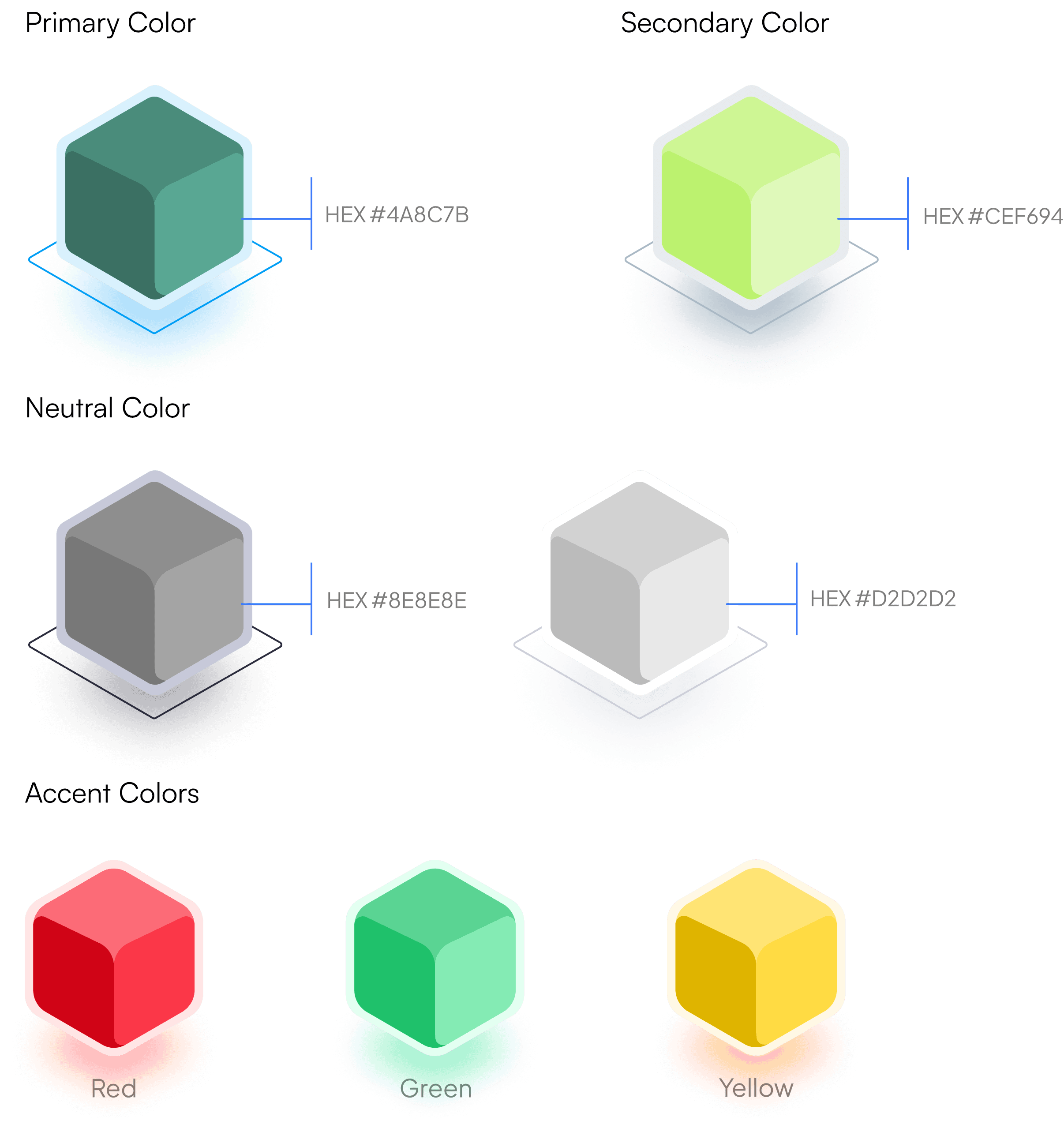
A harmonious set of colors selected to represent the brand and ensure consistent application across all mediums. Includes primary, secondary, neutrals, and accents, each with a range of shades. Colors are the visual voice of a brand, crucial for creating an intuitive and accessible user experience.
A harmonious set of colors selected to represent the brand and ensure consistent application across all mediums. Includes primary, secondary, neutrals, and accents, each with a range of shades. Colors are the visual voice of a brand, crucial for creating an intuitive and accessible user experience.
Typography
Typography
We chose Playfair Display for headings to add a touch of elegance , while Satoshi Variable was used for a clean and modern look, ensuring a balanced and visually appealing design.
We chose Playfair Display for headings to add a touch of elegance , while Satoshi Variable was used for a clean and modern look, ensuring a balanced and visually appealing design.
Satoshi Variable
Primary font
0123456789
abcdefghijklmnopqrstuvwxyz
ABCDEFGHIJKLMNOPQRSTUVWXYZ
!@$¥^~`#%……&*——+-=()[]【】{} <>「 」; :“” ‘ ’\|/。.,?
0123456789
abcdefghijklmnopqrstuvwxyz
ABCDEFGHIJKLMNOPQRSTUVWXYZ
!@$¥^~`#%……&*——+-=()[]【】{} <>「 」; :“” ‘ ’\|/。.,?
Playfair Display
Secondary font
0123456789
abcdefghijklmnopqrstuvwxyz
ABCDEFGHIJKLMNOPQRSTUVWXYZ
!@$¥^~`#%……&*——+-=()[]【】{} <>「 」; :“” ‘ ’\|/。.,?
0123456789
abcdefghijklmnopqrstuvwxyz
ABCDEFGHIJKLMNOPQRSTUVWXYZ
!@$¥^~`#%……&*——+-=()[]【】{} <>「 」; :“” ‘ ’\|/。.,?
Icons
Icons
In the Melon Space Design System, we selected Material Icons aimed to be simple, consistent, and universally recognizable.
In the Melon Space Design System, we selected Material Icons aimed to be simple, consistent, and universally recognizable.
icon sets
Layout Grid, Radius, Spacing, and Elevation
Layout Grid, Radius, Spacing, and Elevation
By using an 8-pixel base unit for grid, radius, spacing, and elevation, we create a unified and scalable design system that is both functional and visually cohesive. This approach simplifies design decisions, improves collaboration, and delivers a seamless user experience.
By using an 8-pixel base unit for grid, radius, spacing, and elevation, we create a unified and scalable design system that is both functional and visually cohesive. This approach simplifies design decisions, improves collaboration, and delivers a seamless user experience.
Building Component Library
During building a component library, we use the method of “measuring spoon circle”. We create a component and use in one of our products then used in another products then back to our original components and extract to align with other products’ preferences.
During building a component library, we use the method of “measuring spoon circle”. We create a component and use in one of our products then used in another products then back to our original components and extract to align with other products’ preferences.
Results after measuring spoon circle method
Our design system includes 11 core components, each built to ensure consistency, scalability, and usability across the product ecosystem. Together, these components form a cohesive library that speeds up design and development, ensures brand consistency, and delivers a seamless user experience.
The following components are our most used components in the design system. For more information → figma
Our design system includes 11 core components, each built to ensure consistency, scalability, and usability across the product ecosystem. Together, these components form a cohesive library that speeds up design and development, ensures brand consistency, and delivers a seamless user experience.
The following components are our most used components in the design system. For more information → figma
Button Component
Button Component
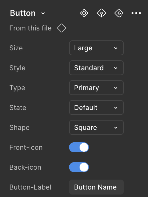
The Button Component is a highly adaptable UI element designed for various interaction needs. In this example, it features a large size, standard style, and primary type, with a square shape.
This configuration highlights the button's flexibility, ensuring it remains consistent and user-friendly across different contexts while maintaining a modern and structured appearance.
The Button Component is a highly adaptable UI element designed for various interaction needs. In this example, it features a large size, standard style, and primary type, with a square shape.
This configuration highlights the button's flexibility, ensuring it remains consistent and user-friendly across different contexts while maintaining a modern and structured appearance.
Button Name
Card Component
Card Component
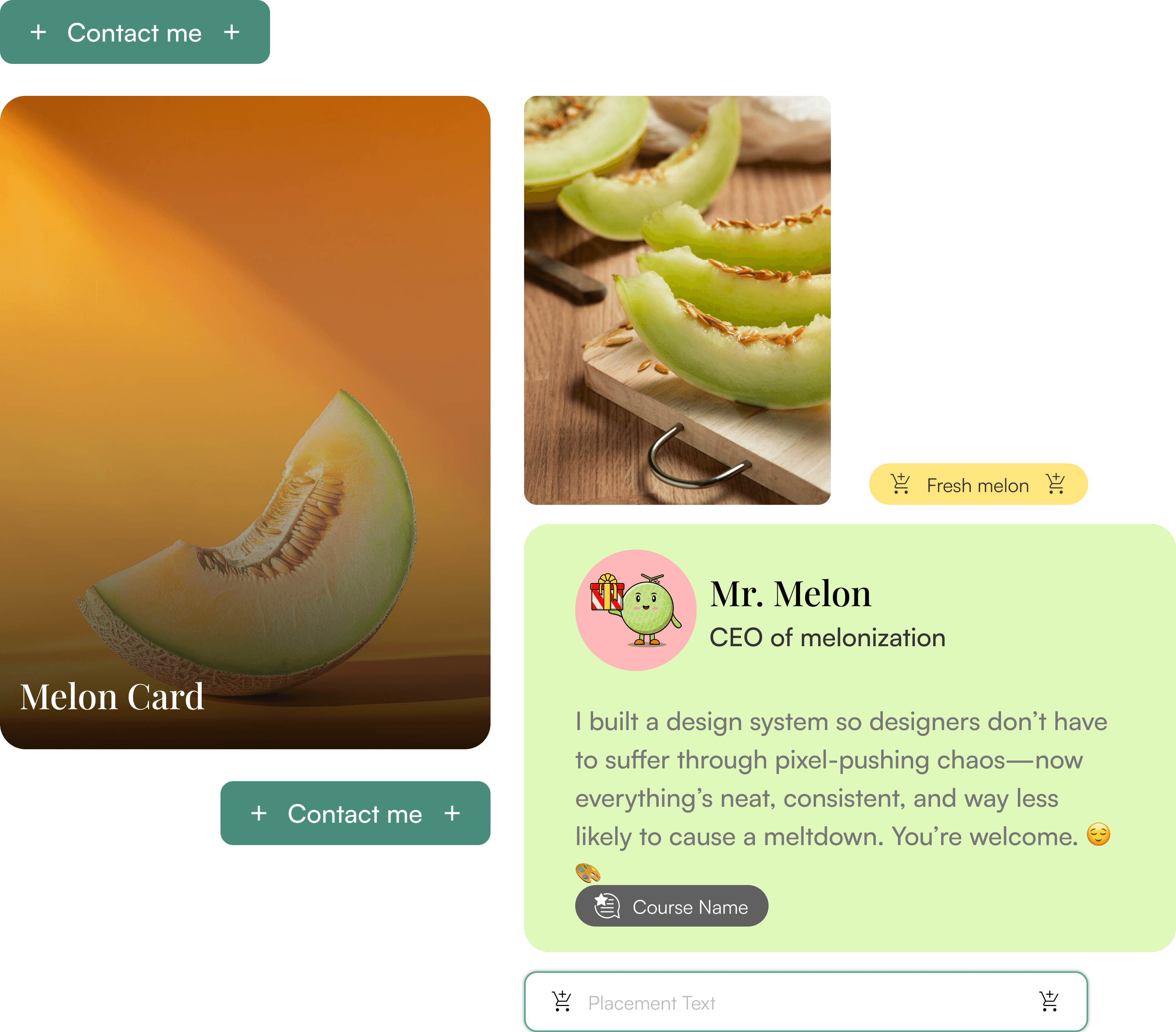
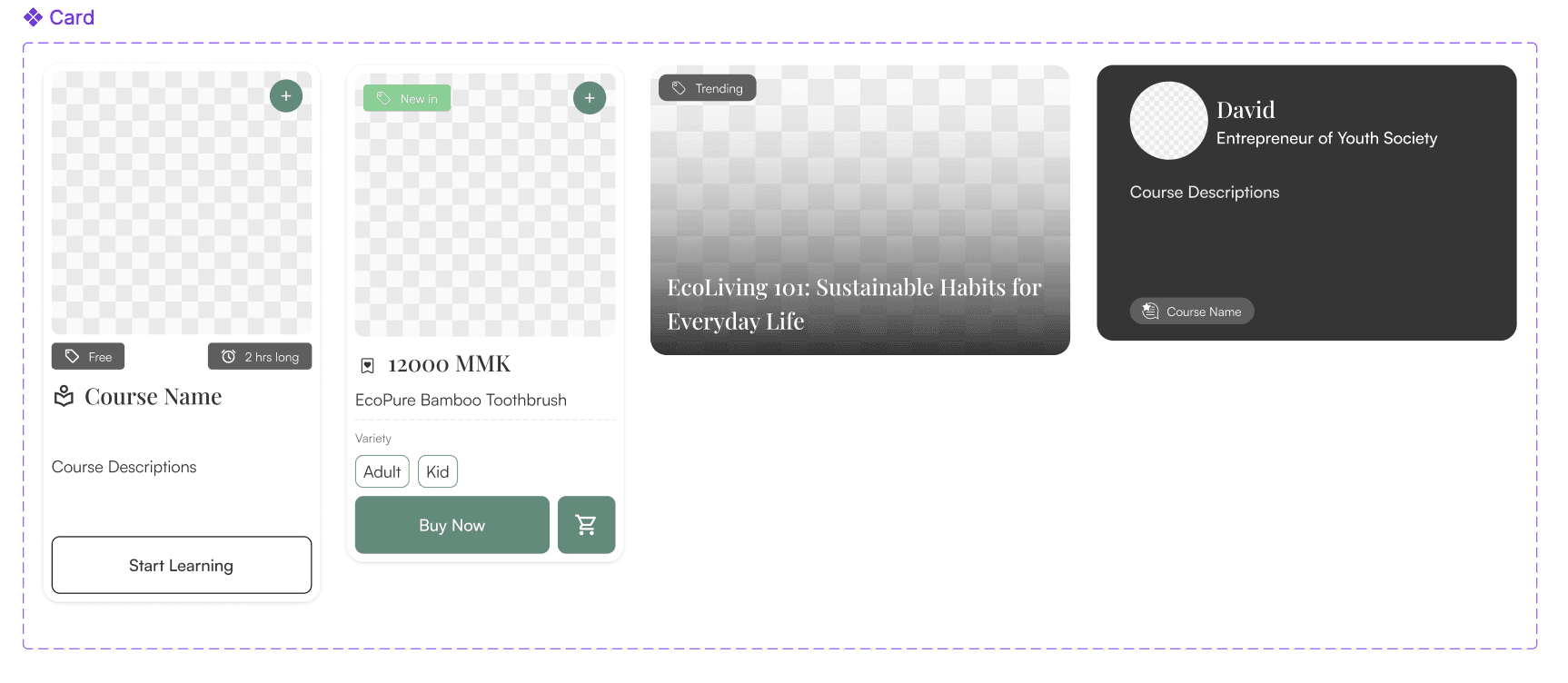
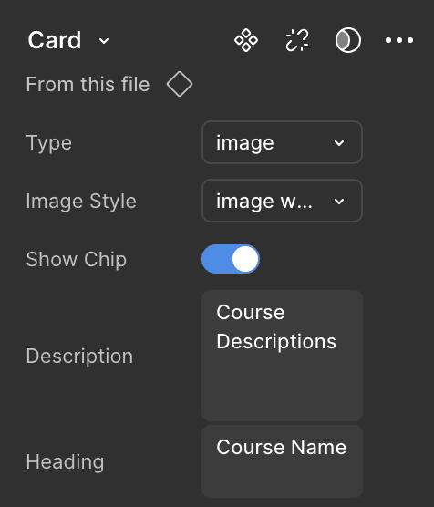
The Card Component is designed to be highly scalable and adjustable, leveraging boolean properties and configurable options to meet diverse use cases.
Using boolean property like Show Chip, the component can dynamically adapt its state and appearance.
The Card Component is designed to be highly scalable and adjustable, leveraging boolean properties and configurable options to meet diverse use cases.
Using boolean property like Show Chip, the component can dynamically adapt its state and appearance.
12000 MMK
Women Cotton Dress
Add to cart
Design Tokens
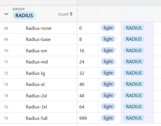
Design Tokens are the foundational elements of our design system, acting as the "single source of truth" for visual attributes like colors, typography, spacing, and more. To ensure clarity and consistency across the design system, we conducted Design Tokens Naming Workshops with the team.
Design Tokens Naming :
Kebab Case ( For example , bg-color-primary). For more information → airtable

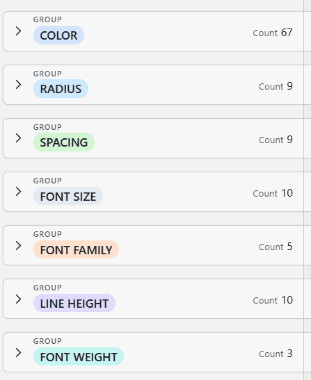
To track and manage these tokens efficiently, we used Airtable as a centralized repository. Design tokens are stored in the GitHub repo as JSON ensuring developers have easy access to the latest updates. This setup allows for seamless synchronization between design and code, reducing manual errors and speeding up implementation.
Why we use Airtable?
By using Airtable, we’ve created a transparent, accessible, and scalable system that keeps the entire team in sync and ensures the design system evolves efficiently.
GitHub Integration
To create a seamless workflow between design and development, we linked Figma with our GitHub repository and stores design tokens as JSON file. Designers can update components in Figma, and changes are automatically reflected in GitHub, keeping everyone on the same page.
For more information → GitHub

Figma File Organization
We offer three purpose-driven Figma files to streamline your design system:
Design System & Component Library – The ultimate toolkit for consistency.
Design Interface – Where the magic of UI comes to life.
Information Architecture and Design System Roadmap – Because structure keeps everything from turning into chaos.

Component Documentation
We don’t just throw components at you—we give them a backstory! Our documentation provides:
Clear Descriptions – What it is for
Usage Guidelines – How to use
Props & Variants – Because one size never fits all.
Design Tokens
Design Tokens are the foundational elements of our design system, acting as the "single source of truth" for visual attributes like colors, typography, spacing, and more. To ensure clarity and consistency across the design system, we conducted Design Tokens Naming Workshops with the team.
Design Tokens are the foundational elements of our design system, acting as the "single source of truth" for visual attributes like colors, typography, spacing, and more. To ensure clarity and consistency across the design system, we conducted Design Tokens Naming Workshops with the team.
Design Tokens Naming :
Design Tokens Naming :
Kebab Case ( For example , bg-color-primary). For more information → airtable
Kebab Case ( For example , bg-color-primary). For more information → airtable
To track and manage these tokens efficiently, we used Airtable as a centralized repository. Design tokens are stored in the GitHub repo as JSON ensuring developers have easy access to the latest updates. This setup allows for seamless synchronization between design and code, reducing manual errors and speeding up implementation.
To track and manage these tokens efficiently, we used Airtable as a centralized repository. Design tokens are stored in the GitHub repo as JSON ensuring developers have easy access to the latest updates. This setup allows for seamless synchronization between design and code, reducing manual errors and speeding up implementation.
Why we use Airtable?
By using Airtable, we’ve created a transparent, accessible, and scalable system that keeps the entire team in sync and ensures the design system evolves efficiently.
By using Airtable, we’ve created a transparent, accessible, and scalable system that keeps the entire team in sync and ensures the design system evolves efficiently.
GitHub Integration
GitHub Integration
To create a seamless workflow between design and development, we linked Figma with our GitHub repository and stores design tokens as JSON file. Designers can update components in Figma, and changes are automatically reflected in GitHub, keeping everyone on the same page.
To create a seamless workflow between design and development, we linked Figma with our GitHub repository and stores design tokens as JSON file. Designers can update components in Figma, and changes are automatically reflected in GitHub, keeping everyone on the same page.
For more information → GitHub
Figma File Organization
Figma File Organization
We offer three purpose-driven Figma files to streamline your design system:
Design System & Component Library – The ultimate toolkit for consistency.
Design Interface – Where the magic of UI comes to life.
Information Architecture and Design System Roadmap – Because structure keeps everything from turning into chaos.
We offer three purpose-driven Figma files to streamline your design system:
Design System & Component Library – The ultimate toolkit for consistency.
Design Interface – Where the magic of UI comes to life.
Information Architecture and Design System Roadmap – Because structure keeps everything from turning into chaos.
Component Documentation
Component Documentation
We don’t just throw components at you—we give them a backstory! Our documentation provides:
Clear Descriptions – What it is for
Usage Guidelines – How to use
Props & Variants – Because one size never fits all.
We don’t just throw components at you—we give them a backstory! Our documentation provides:
Clear Descriptions – What it is for
Usage Guidelines – How to use
Props & Variants – Because one size never fits all.
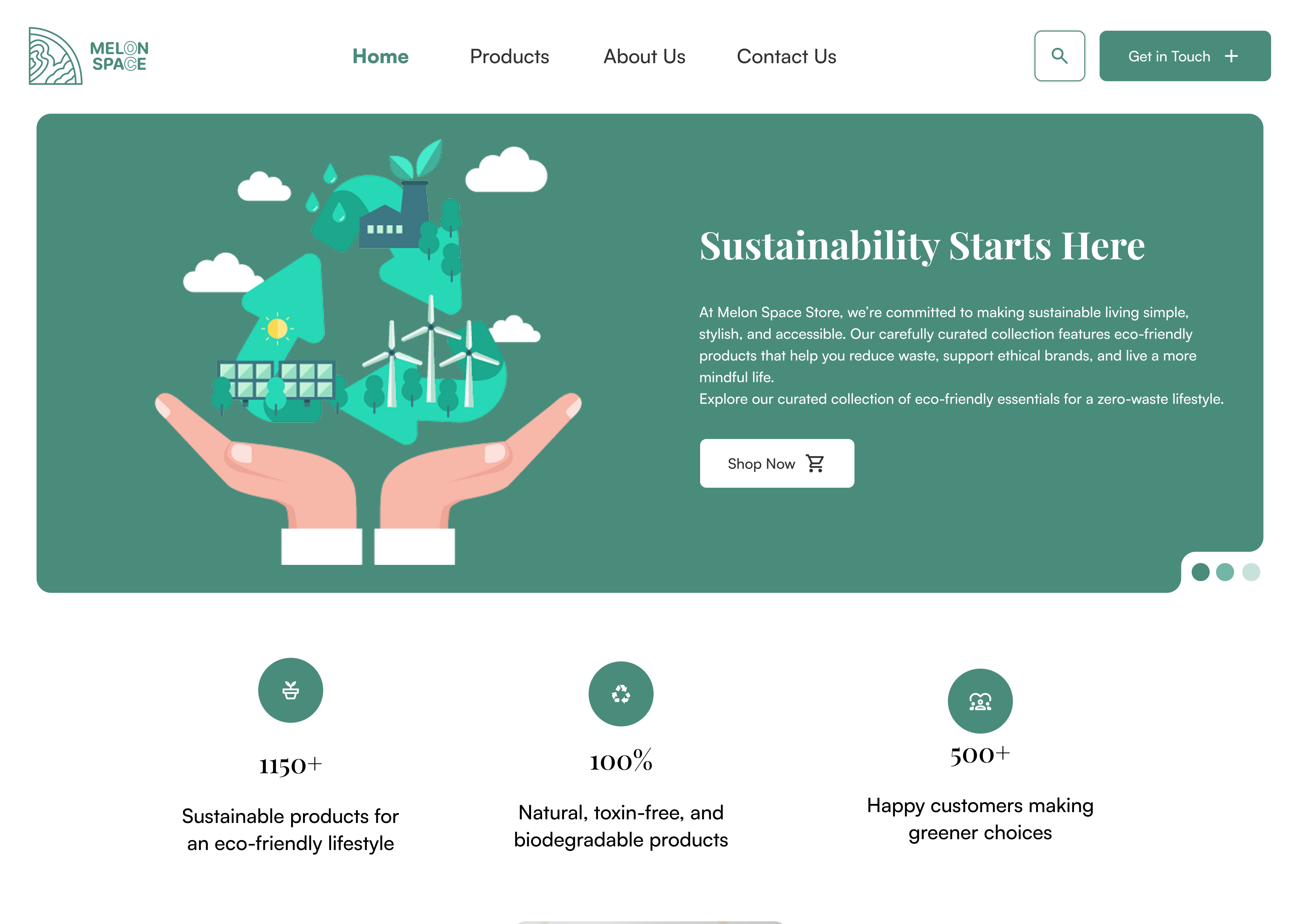
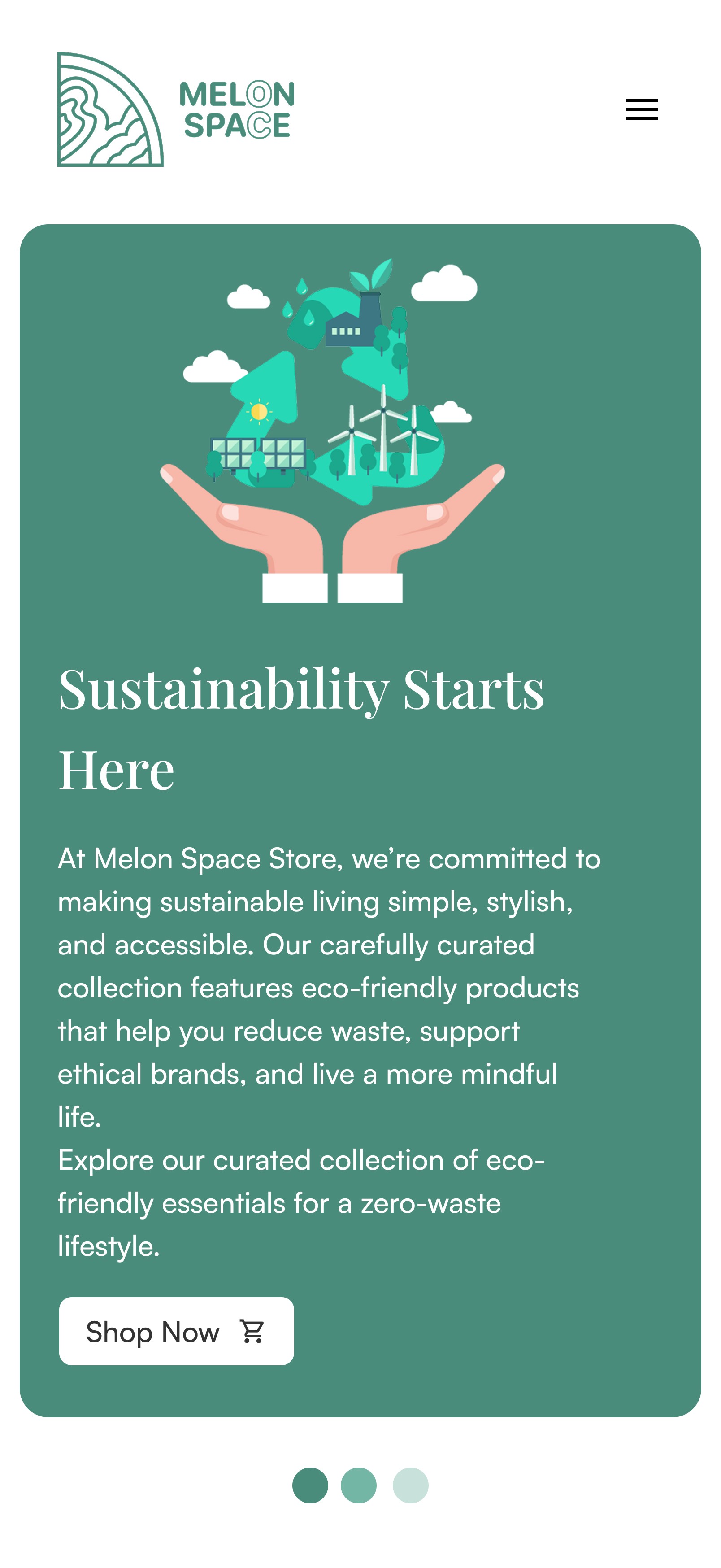
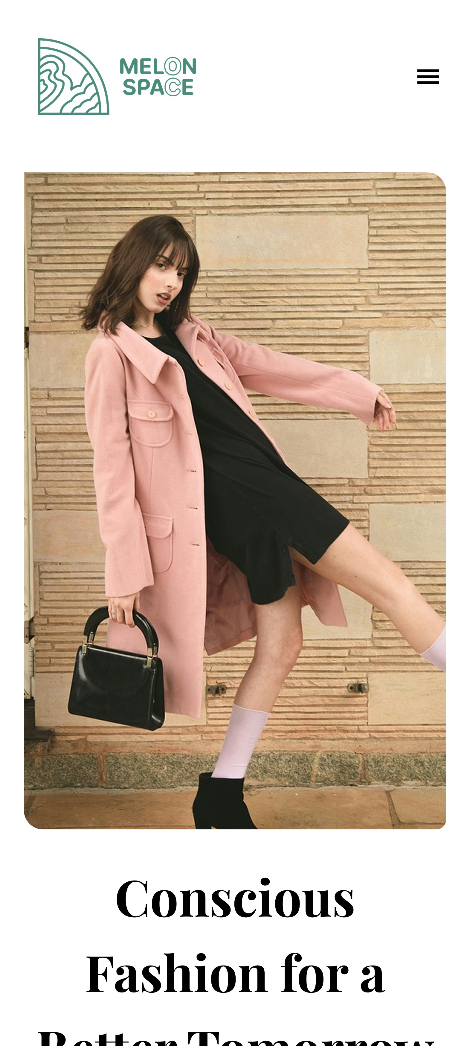
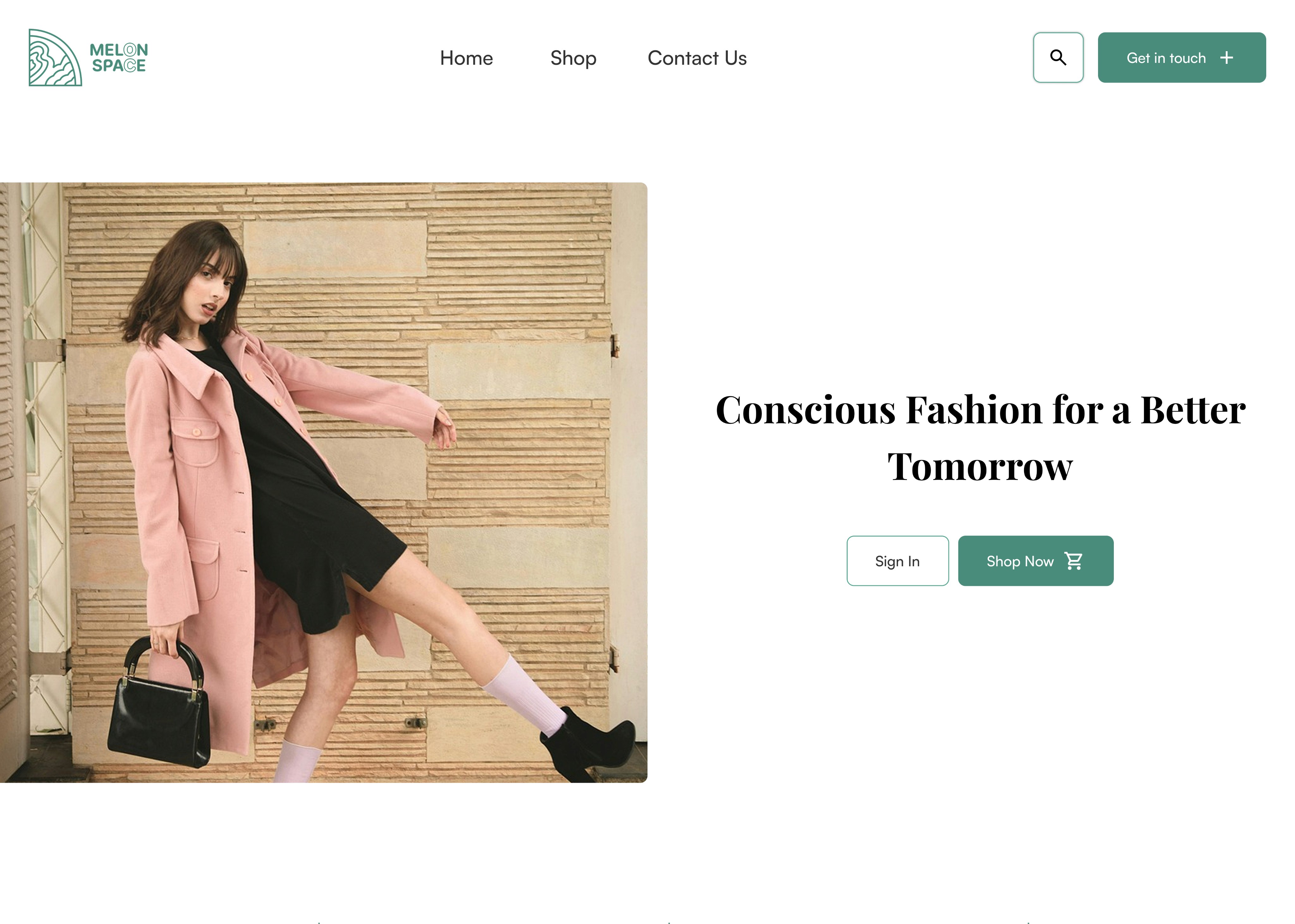
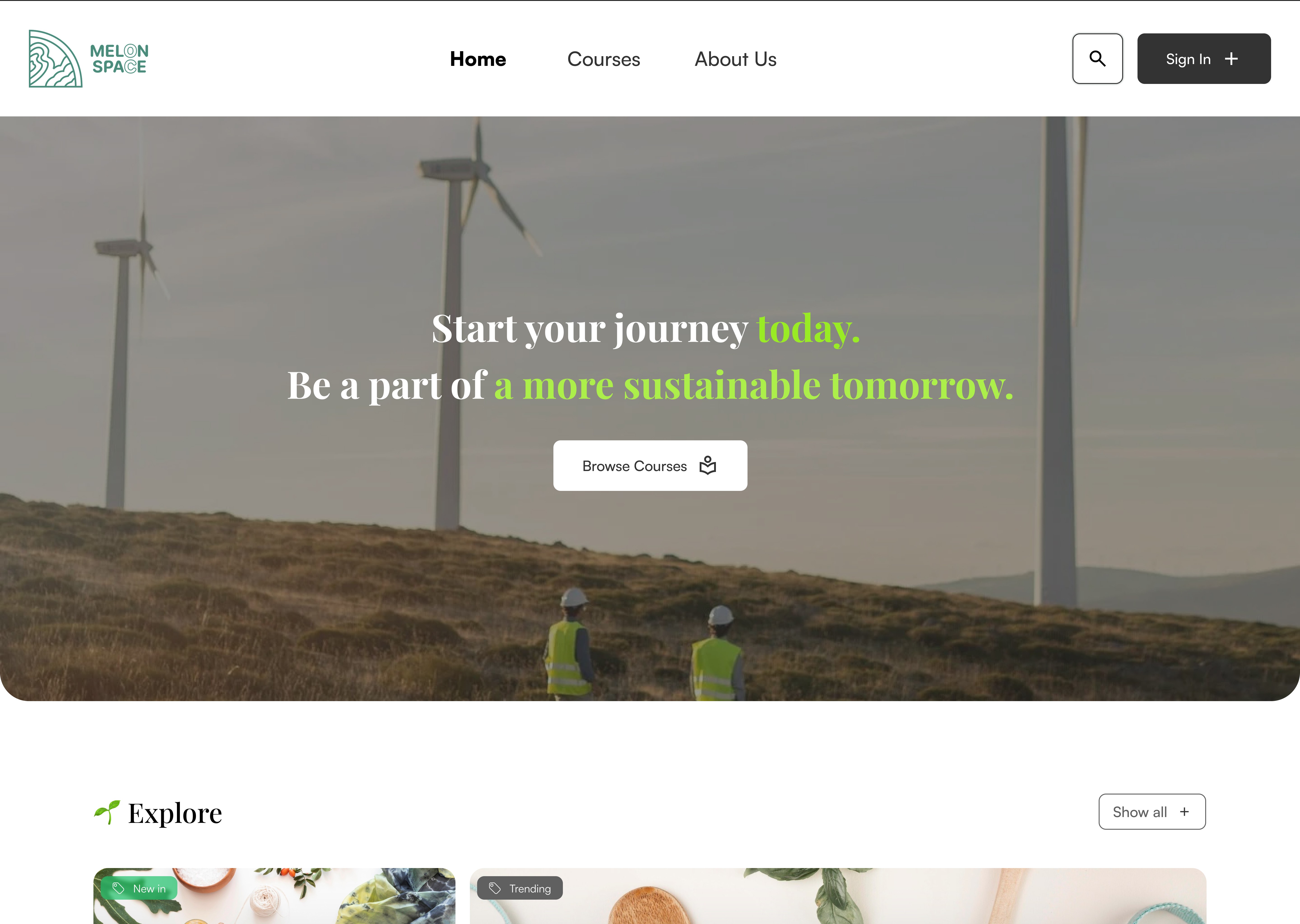
Mockup Designs using Melon Design system

Our Project Links
Future Approach
Scalability First
Scalability First
More components, better flexibility, and seamless integrations
More components, better flexibility, and seamless integrations
Better Tokens
Better Tokens
Currently, we didn't test toekens with developers yet but in the future , we hope we can collaborate with developers and create advanced and better tokens.
Currently, we didn't test toekens with developers yet but in the future , we hope we can collaborate with developers and create advanced and better tokens.
Future Approach
Scalability First
Scalability First
More components, better flexibility, and seamless integrations
More components, better flexibility, and seamless integrations
Better Tokens
Better Tokens
Currently, we didn't test toekens with developers yet but in the future , we hope we can collaborate with developers and create advanced and better tokens.
Currently, we didn't test toekens with developers yet but in the future , we hope we can collaborate with developers and create advanced and better tokens.